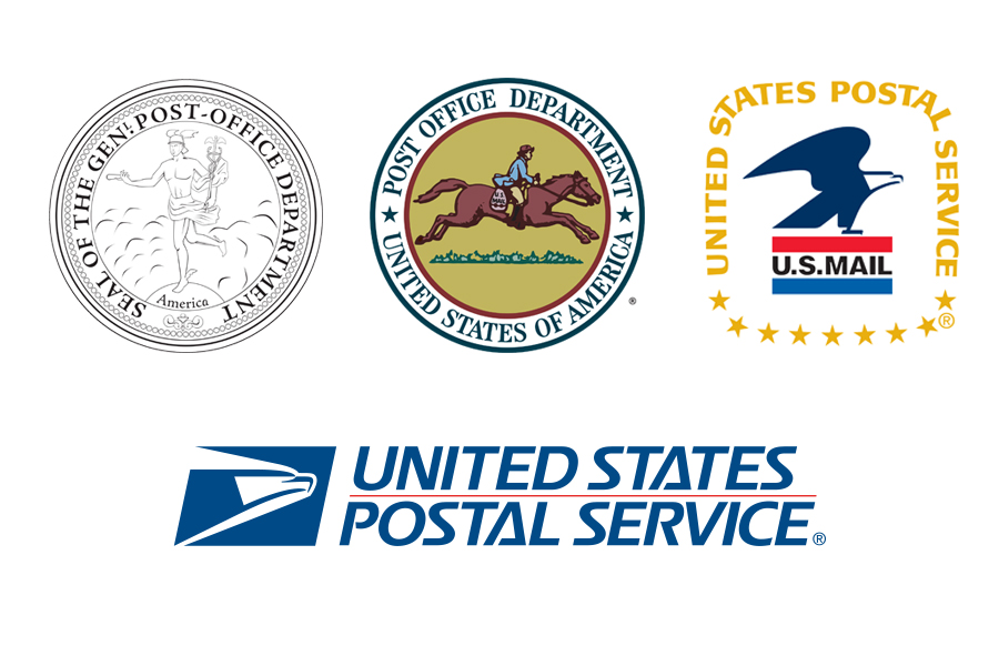
The Postal Service logo is a well-known American symbol, but it hasn’t always looked the way it does today. Here’s how the postal insignia has evolved over time.
1. Mercury. In 1782, then-Postmaster General Ebenezer Hazard used an image of Mercury, the winged-messenger of the Roman gods, in his official postal seal.
2. Post rider. Seeking a modern representation of the mail in motion, an image of a horse carrying a rider and a mailbag was chosen in 1837 for the Post Office Department seal.
3. The eagle. When the 1970 Postal Reorganization Act transformed the Post Office Department into USPS, officials unveiled a new seal created by the firm of famed industrial designer Raymond Loewy with an eagle poised for flight.
4. The current logo. In 1993, USPS adopted its current logo, which features a “sonic” blue eagle looking forward to symbolize the organization’s future.
Got ideas for future editions of “The list”? Email them to uspslink@usps.gov.
